![]() I have compiled a list of my top 10 personal favorite OS X Leopard tweaks. These tweaks not only beautify Leopard but are also sure to give you a much better user experience.
I have compiled a list of my top 10 personal favorite OS X Leopard tweaks. These tweaks not only beautify Leopard but are also sure to give you a much better user experience.
As you may expect, some of these are pretty old, the links can be a bit, shall we say ‘tenuous’ and so we’ve updated and revised links as appropriate.
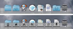
1. Stacks Overlays – [Update – sorry this link had to be removed – Ed.] I’m sure I will catch some flak for this but stacks are one of my favorite new features in Leopard. However, I think Apple could have done a much better job with the way they look. Optica-Optima decided to make them more appealing by overlaying their default icon with a new transparent “drawer” icon. The result is a much better looking stacks icon that really gives it the feel of having depth.
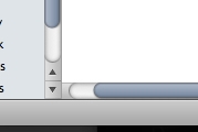
2. Better Scroll Bars – If you have used the newest version of iTunes then you have probably noticed that it uses its own set of, in my opinion, better looking scroll bars than the default Leopard scroll bars. This tweak allows you to replace all of your Leopard scroll bars with the much better looking iTunes scroll bars.
3. Recent Items Stack – This tweak is similar to the “My Recent Documents” feature in Windows but instead gives you a stack of your recently opened items in Leopard. By default it shows you your most recently used applications but when you right-click (or control-click) it you will see a menu that lets you change it to either recent applications, recent documents, recent servers, favorite volumes, or favorite items.

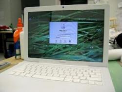
4. Replace Leopard’s Login Screen – If you are tired of the default Aurora login screen then use this tweak to change it to whatever you like.
5. Add Spacers To The Dock – If you would like to separate out your dock icons into groups then use this tweak to create empty spaces in between them.

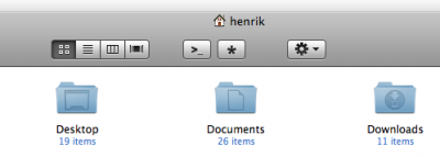
6. Open Terminal Here – [Update: Sorry, link no longer available – Ed.] I used to love this feature in Windows PowerToys and now you can do the same thing in Leopard. This tweak puts a button in Finder that will open a Terminal window directly from the directory you are browsing.
7. Replace The Dock – There are actually two great sites, Dockulicious [Sorry that site doesn’t seem to be used for that anymore – Ed.] and LeopardDocks, that have a wide selection of beautiful user submitted docs. And, if you don’t like the 3D dock you can always change it back to a 2D dock similar to how it was in Tiger.

8. Menu Bar Tint – The new Leopard menu bar is translucent so whatever is behind it shows through. If you would prefer a solid menu bar, you can easily make it opaque. However, when you do this it becomes solid white and is very bright. With this tweak you can add tint to it.
![]()
9. Highlight Stacks Item On Mouseover – This simple tweak allows you to highlight the item your mouse is currently over when viewing a stack.
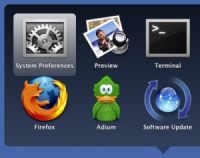
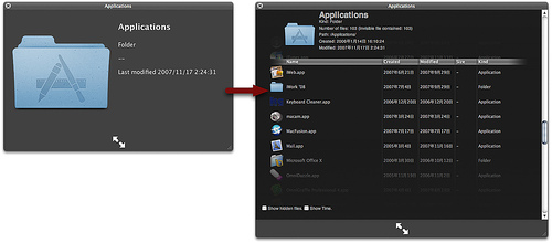
10. Folder List Quick Look – When you are browsing through Finder, you can hit your spacebar or click the “Quick Look” button to see more detailed information about the folder or item highlighted. With this tweak, not only will you see the folder information, but you will also see a list of what the folder contains as well as information about its contents.
Bonus: Full Directory Path In Finder – This tweak is for you power users who want to know the exact location of where you are at in Finder. When enabled, it shows you the full path of the current directory you are browsing in the Finder title bar. 
Please feel free to post your favorite Leopard tweaks as well.

Leave A Response